
ATHEN

ATHEN to autorska koncepcja marki kosmetycznej premium, stworzona z myślą o zaprojektowaniu spójnego systemu identyfikacji wizualnej oraz jego zastosowaniu w przestrzeni cyfrowej.Projekt obejmował opracowanie identyfikacji wizualnej, opakowań, materiałów promocyjnych oraz koncepcji strony internetowej, która stanowi naturalne rozwinięcie komunikacji marki. Celem było stworzenie estetyki łączącej minimalizm, wysoką jakość i nowoczesny charakter.


Projektując cyfrową odsłonę marki, skupiłam się na przełożeniu jej wartości na czytelny i konsekwentny język wizualny. Charakterystycznym motywem stały się zaokrąglone przyciski inspirowane formą pipety, które subtelnie nawiązują do produktów i budują spójność całego systemu identyfikacji.


Banery zostały zaprojektowane zgodnie z zasadą „less is more” – z naciskiem na prosty przekaz, czytelną kompozycję i szybkie przyciągnięcie uwagi odbiorcy. Przygotowałam dwa warianty kreacji, zachowując spójność wizualną i minimalistyczny charakter projektu.


NESBON
NESBON to koncepcyjny projekt identyfikacji wizualnej promuj�ącej premierę kolekcji Strawberry Collection oraz wydarzenie
inaugurujące jej premierę. Założeniem było stworzenie komunikacji, która bardziej przypomina kampanię
domu mody niż klasyczną reklamę produktu.


Projekt obejmuje materiały promujące wydarzenie – zaproszenia, lookbook, billboard oraz key visuale wykorzystywane
w komunikacji marki. Całość oparto na wyrazistej typografii i ograniczonej palecie barw, dzięki czemu uwaga odbiorcy
koncentruje się na kolekcji i budowanej wokół niej atmosferze. Inspiracją był współczesny editorial fashion, dlatego projekt łączy
prostąkompozycję z odważnymi akcentami wizualnymi, tworząc spójny system komunikacji dla marki z segmentu premium.


ROZI
ROZI to autorska koncepcja marki odzieżowej, stworzona jako próba zbudowania nowoczesnej komunikacji opartej
na prostocie, mocnej typografii i wyrazistym charakterze wizualnym. Projekt obejmuje identyfikację wizualną oraz materiały promocyjne
zaprojektowane z myślą o premierze kolekcji. Założeniem było stworzenie systemu komunikacji, który eksponuje produkt,
jednocześnie budując rozpoznawalny i spójny wizerunek marki.


Inspiracją była współczesna estetyka fashion editorial, dlatego projekt opiera się na ograniczonej palecie
kolorystycznej,wyraźnych kontrastach i prostych kompozycjach, które nadają marce charakter premium.


JSQ
JSQ to autorska koncepcja kampanii promującej premierę nowej kolekcji mebli. Projekt powstał z myślą o stworzeniu spójnej komunikacji, która podkreśla charakter kolekcji i buduje jej rozpoznawalność na różnych nośnikach.


W ramach projektu opracowałam key visual oraz zestaw materiałów promocyjnych przeznaczonych do komunikacji online i offline. Głównym założeniem było stworzenie systemu, który można łatwo rozwijać w kolejnych odsłonach kampanii, zachowując konsekwentny język wizualny.


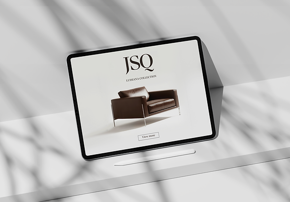
Projekt opiera się na wyrazistej kompozycji, oszczędnej typografii i świadomym wykorzystaniu przestrzeni, dzięki czemu uwaga odbiorcy skupia się na kolekcji oraz jej charakterystycznych formach.


MOLER
Luksusowy samochód nie potrzebuje krzykliwej reklamy. Potrzebuje oprawy, która podkreśli jego charakter.
Z myślą o tym powstał projekt kampanii promującej premierę nowego modelu marki MOLLER. Celem było stworzenie eleganckiej komunikacji, która eksponuje samochód, buduje atmosferę premium i pozostaje czytelna niezależnie od nośnika.

Projekt obejmuje koncepcję strony internetowej oraz materiały promocyjne zaprojektowane jako element jednej kampanii. Całość opiera się na prostych kompozycjach, mocnych fotografiach i oszczędnej typografii, dzięki czemu uwaga odbiorcy pozostaje skupiona na samochodzie i jego detalach.


HERNES
Przestrzeń może budować emocje równie skutecznie jak sam produkt.
Projekt HERNES powstał z myślą o stworzeniu komunikacji wizualnej dla kolekcji mebli i dodatków do wnętrz, której charakter opiera się na harmonii, prostocie i ponadczasowej estetyce. Celem było zaprojektowanie materiałów promocyjnych, które eksponują produkty, jednocześnie budując spokojny i elegancki wizerunek marki.
hg.png)

Całość opiera się na oszczędnych kompozycjach, subtelnej typografii oraz stonowanej palecie kolorystycznej inspirowanej naturalnymi materiałami. Charakterystycznym motywem projektu są łuki, które nawiązują do architektury wnętrz i miękkich form mebli. Powtarzający się element porządkuje komunikację oraz nadaje jej rozpoznawalny, spójny charakter we wszystkich materiałach kampanii.


Projekt został zaprojektowany z myślą o budowaniu atmosfery spokoju, elegancji i ponadczasowego designu. Szczególną uwagę poświęciłam harmonii kompozycji, odpowiedniemu wykorzystaniu negatywnej przestrzeni oraz subtelnym detalom graficznym, które podkreślają ekskluzywny charakter marki. Spójna kolorystyka inspirowana odcieniami wnętrz oraz minimalistyczna typografia tworzą nowoczesny system identyfikacji wizualnej, łatwy do adaptacji w różnych kanałach komunikacji.

BasicLab
Silna marka nie potrzebuje nowej tożsamości. Potrzebuje komunikacji, która rozwija jej dotychczasowy język wizualny.
Projekt powstał jako studium przypadku dla marki BasicLab i koncentrował się na opracowaniu materiałów promujących wybrane produkty oraz edukujących użytkowników w zakresie ich stosowania. Pracowałam na dostarczonych packshotach produktów, tworząc spójny system materiałów przeznaczonych do komunikacji digital.


Celem było połączenie eksperckiego charakteru marki z estetyką, która pozostaje czytelna, nowoczesna i angażująca. Na etapie koncepcyjnym testowałam różne rozwiązania kompozycyjne i kierunki wizualne, aby znaleźć formę najlepiej wpisującą się w charakter BasicLab, jednocześnie zachowując przejrzystość przekazu i wyraźną hierarchię informacji.
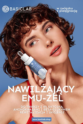


Projekt koncepcyjny stworzony w celach prezentacji procesu projektowego i umiejętności z zakresu art direction oraz komunikacji wizualnej.
Cinema City
Projekt obejmował stworzenie koncepcji kampanii promującej kartę Cinema City Unlimited, której motywem przewodnim było zestawienie wizyty w kinie z przyjemnością jedzenia sushi. Główną ideą kreatywną było pokazanie,że z kartyUnlimited korzysta się z takim samym apetytem i częstotliwością,
z jaką sięga się po ulubione sushi.

Aby podkreślić ten przekaz, stworzyłam kompozycję, w której karta została zaprezentowana niczym element zestawu sushi, z wykorzystaniem pałeczek i minimalistycznej scenografii. Całość utrzymano w eleganckiej, ciemnej kolorystyce z charakterystycznymi pomarańczowymi akcentami marki, co pozwoliło zachować czytelność komunikatu i skutecznie wyeksponować produkt.
Projekt koncepcyjny stworzony w celach prezentacji procesu projektowego i umiejętności z zakresu art direction oraz komunikacji wizualnej.